Note
Go to the end to download the full example code or to run this example in your browser via Binder
Clustering#
In this example, the use of the clustering plot methods is shown applied to the Canadian Weather dataset. K-Means and Fuzzy K-Means algorithms are employed to calculate the results plotted.
# Author: Amanda Hernando Bernabé
# License: MIT

# sphinx_gallery_thumbnail_number = 6

import matplotlib.pyplot as plt
import numpy as np

from skfda import datasets
from skfda.exploratory.visualization.clustering import (
    ClusterMembershipLinesPlot,
    ClusterMembershipPlot,
    ClusterPlot,
)
from skfda.ml.clustering import FuzzyCMeans, KMeans
First, the Canadian Weather dataset is downloaded from the package ‘fda’ in CRAN. It contains a FDataGrid with daily temperatures and precipitations, that is, it has a 2-dimensional image. We are interested only in the daily average temperatures, so we select the first coordinate function.
X, y = datasets.fetch_weather(return_X_y=True, as_frame=True)
fd = X.iloc[:, 0].values
fd_temperatures = fd.coordinates[0]
target = y.values

# The desired FDataGrid only contains 10 random samples, so that the example
# provides clearer plots.
indices_samples = np.array([1, 3, 5, 10, 14, 17, 21, 25, 27, 30])
fd = fd_temperatures[indices_samples]
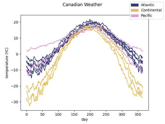
The data is plotted to show the curves we are working with. They are divided according to the target. In this case, it includes the different climates to which the weather stations belong to.
climates = target[indices_samples].remove_unused_categories()

# Assigning the color to each of the groups.
colormap = plt.cm.get_cmap('tab20b')
n_climates = len(climates.categories)
climate_colors = colormap(np.arange(n_climates) / (n_climates - 1))

fd.plot(group=climates.codes, group_names=climates.categories,
        group_colors=climate_colors)
/home/docs/checkouts/readthedocs.org/user_builds/fda/checkouts/latest/examples/plot_clustering.py:49: MatplotlibDeprecationWarning: The get_cmap function was deprecated in Matplotlib 3.7 and will be removed two minor releases later. Use ``matplotlib.colormaps[name]`` or ``matplotlib.colormaps.get_cmap(obj)`` instead.
  colormap = plt.cm.get_cmap('tab20b')

<Figure size 640x480 with 1 Axes>
The number of clusters is set with the number of climates, in order to see the performance of the clustering methods, and the seed is set to one in order to obatain always the same result for the example.
n_clusters = n_climates
seed = 2
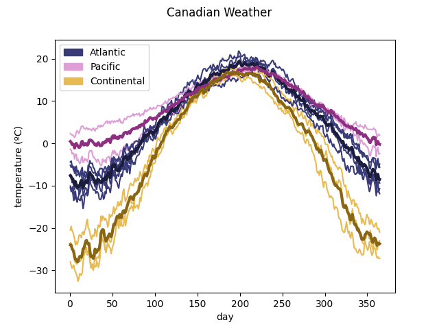
First, the class KMeans is instantiated with
the desired. parameters. Its fit() method
is called, resulting in the calculation of several attributes which include
among others, the the number of cluster each sample belongs to (labels), and
the centroids of each cluster. The labels are obtaiined calling the method
predict().
kmeans = KMeans(n_clusters=n_clusters, random_state=seed)
kmeans.fit(fd)
print(kmeans.predict(fd))
[0 1 0 0 0 2 2 1 0 2]
To see the information in a graphic way, the method
plot_clusters() can
be used.
# Customization of cluster colors and labels in order to match the first image
# of raw data.
cluster_colors = climate_colors[np.array([0, 2, 1])]
cluster_labels = climates.categories[np.array([0, 2, 1])]

ClusterPlot(kmeans, fd, cluster_colors=cluster_colors,
            cluster_labels=cluster_labels).plot()
<Figure size 640x480 with 1 Axes>
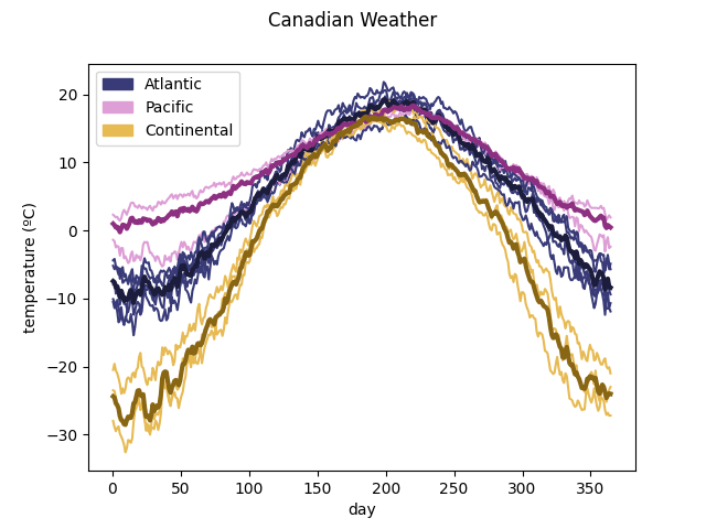
Other clustering algorithm implemented is the Fuzzy K-Means found in the
class FuzzyCMeans. Following the
above procedure, an object of this type is instantiated with the desired
data and then, the
fit() method is called.
Internally, the attribute membership_degree_ is calculated, which contains
´n_clusters´ elements for each sample and dimension, denoting the degree of
membership of each sample to each cluster. They are obtained calling the
method predict_proba(). Also, the centroids
of each cluster are obtained.
fuzzy_kmeans = FuzzyCMeans(n_clusters=n_clusters, random_state=seed)
fuzzy_kmeans.fit(fd)
print(fuzzy_kmeans.predict_proba(fd))
[[0.8721254  0.11189295 0.01598165]
 [0.4615364  0.51285956 0.02560405]
 [0.97428363 0.01882257 0.0068938 ]
 [0.91184323 0.05369029 0.03446648]
 [0.79072268 0.18411219 0.02516513]
 [0.178624   0.05881132 0.76256468]
 [0.01099498 0.00492593 0.98407909]
 [0.03156897 0.96349997 0.00493106]
 [0.8084018  0.13418057 0.05741763]
 [0.03767122 0.01891178 0.943417  ]]
To see the information in a graphic way, the method
plot_clusters() can
be used. It assigns each sample to the cluster whose membership value is the
greatest.
<Figure size 640x480 with 1 Axes>
Another plot implemented to show the results in the class
FuzzyCMeans is
plot_cluster_lines()
which is similar to parallel coordinates. It is recommended to assign colors
to each of the samples in order to identify them. In this example, the
colors are the ones of the first plot, dividing the samples by climate.
colors_by_climate = colormap(climates.codes / (n_climates - 1))

ClusterMembershipLinesPlot(fuzzy_kmeans, fd, cluster_labels=cluster_labels,
                           sample_colors=colors_by_climate).plot()
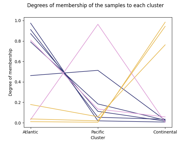
<Figure size 640x480 with 1 Axes>
Finally, the function
plot_cluster_bars()
returns a barplot. Each sample is designated with a bar which is filled
proportionally to the membership values with the color of each cluster.
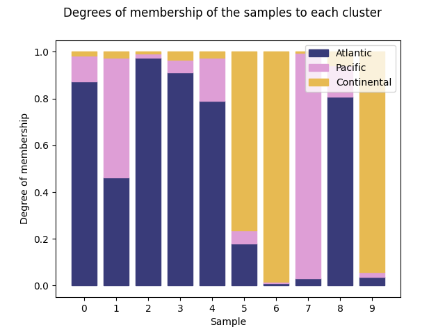
<Figure size 640x480 with 1 Axes>
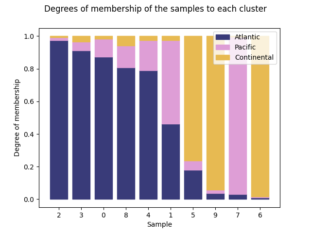
The possibility of sorting the bars according to a cluster is given specifying the number of cluster, which belongs to the interval [0, n_clusters).
We can order the data using the first cluster:
ClusterMembershipPlot(fuzzy_kmeans, fd, sort=0, cluster_colors=cluster_colors,
                      cluster_labels=cluster_labels).plot()
<Figure size 640x480 with 1 Axes>
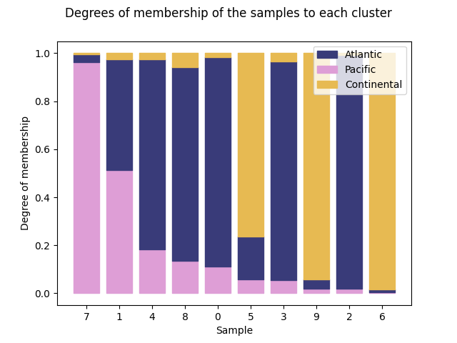
Using the second cluster:
ClusterMembershipPlot(fuzzy_kmeans, fd, sort=1, cluster_colors=cluster_colors,
                      cluster_labels=cluster_labels).plot()
<Figure size 640x480 with 1 Axes>
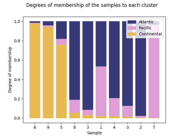
And using the third cluster:
ClusterMembershipPlot(fuzzy_kmeans, fd, sort=2, cluster_colors=cluster_colors,
                      cluster_labels=cluster_labels).plot()
<Figure size 640x480 with 1 Axes>
Total running time of the script: (0 minutes 1.479 seconds)