Note
Go to the end to download the full example code. or to run this example in your browser via Binder
Magnitude-Shape Plot#
Shows the use of the MS-Plot applied to the Canadian Weather dataset.
# Author: Amanda Hernando Bernabé
# License: MIT

# sphinx_gallery_thumbnail_number = 2

import matplotlib
import matplotlib.pyplot as plt
import numpy as np

from skfda import datasets
from skfda.exploratory.depth import IntegratedDepth
from skfda.exploratory.depth.multivariate import SimplicialDepth
from skfda.exploratory.visualization import MagnitudeShapePlot
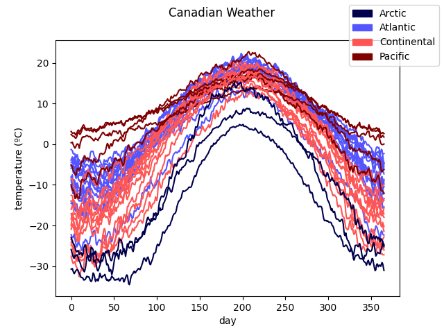
First, the Canadian Weather dataset is downloaded from the package ‘fda’ in CRAN. It contains a FDataGrid with daily temperatures and precipitations, that is, it has a 2-dimensional image. We are interested only in the daily average temperatures, so we extract the first coordinate.
The data is plotted to show the curves we are working with. They are divided according to the target. In this case, it includes the different climates to which the weather stations belong.
# Each climate is assigned a color. Defaults to grey.
colormap = matplotlib.colormaps['seismic']
label_names = target.categories
nlabels = len(label_names)
label_colors = colormap(np.arange(nlabels) / (nlabels - 1))

fd_temperatures.plot(
    group=target.codes,
    group_colors=label_colors,
    group_names=label_names,
)
<Figure size 640x480 with 1 Axes>
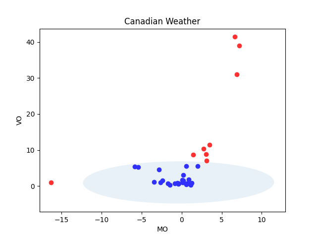
The MS-Plot is generated. In order to show the results, the
plot() method
is used. Note that the colors have been specified before to distinguish
between outliers or not. In particular the tones of the default colormap,
(which is ‘seismic’ and can be customized), are assigned.
msplot = MagnitudeShapePlot(
    fd_temperatures,
    multivariate_depth=SimplicialDepth(),
)

color = 0.3
outliercol = 0.7

msplot.color = color
msplot.outliercol = outliercol
msplot.plot()
<Figure size 640x480 with 1 Axes>
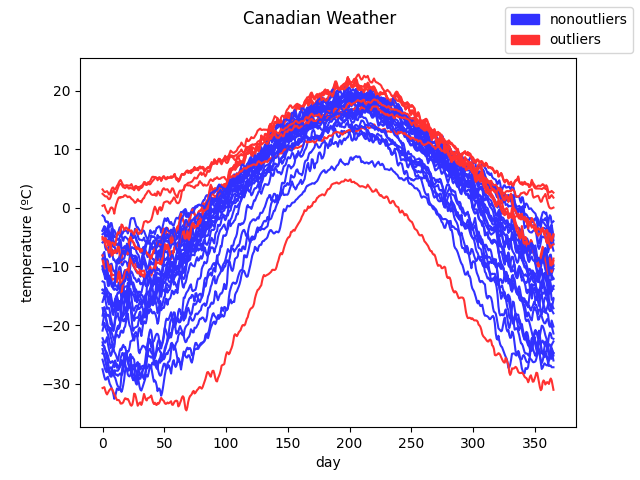
To show the utility of the plot, the curves are plotted according to the distinction made by the MS-Plot (outliers or not) with the same colors.
fd_temperatures.plot(
    group=msplot.outliers.astype(int),
    group_colors=msplot.colormap([color, outliercol]),
    group_names=['nonoutliers', 'outliers'],
)
<Figure size 640x480 with 1 Axes>
We can observe that most of the curves pointed as outliers belong either to the Pacific or Arctic climates which are not the common ones found in Canada. The Pacific temperatures are much smoother and the Arctic ones much lower, differing from the rest in shape and magnitude respectively.
There are two curves from the Arctic climate which are not pointed as outliers but in the MS-Plot, they appear further left from the central points. This behaviour can be modified specifying the parameter alpha.
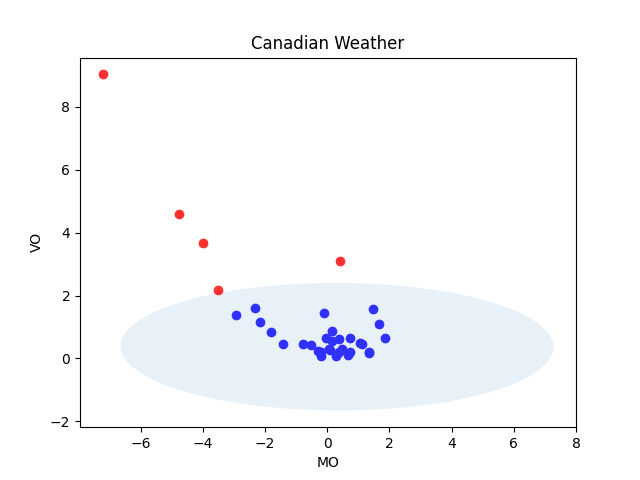
Now we use the default multivariate depth from
IntegratedDepth() in the
MS-Plot.
msplot = MagnitudeShapePlot(
    fd_temperatures,
    multivariate_depth=IntegratedDepth().multivariate_depth,
)

msplot.color = color
msplot.outliercol = outliercol
msplot.plot()
<Figure size 640x480 with 1 Axes>
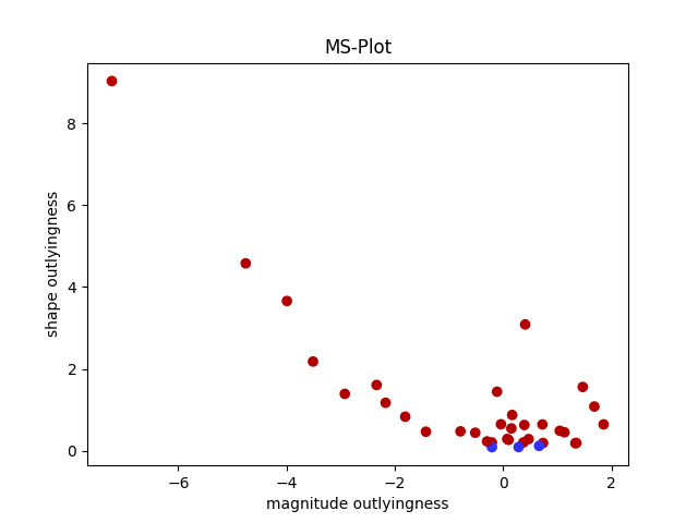
We can observe that almost none of the samples are pointed as outliers. Nevertheless, if we group them in three groups according to their position in the MS-Plot, the result is the expected one. Those samples at the left (larger deviation in the mean directional outlyingness) correspond to the Arctic climate, which has lower temperatures, and those on top (larger deviation in the directional outlyingness) to the Pacific one, which has smoother curves.
group1 = np.where(msplot.points[:, 0] < -0.6)
group2 = np.where(msplot.points[:, 1] > 0.12)

colors = np.copy(msplot.outliers).astype(float)
colors[:] = color
colors[group1] = outliercol
colors[group2] = 0.9

fig = plt.figure()
ax = fig.add_subplot(1, 1, 1)
ax.scatter(msplot.points[:, 0], msplot.points[:, 1], c=colormap(colors))
ax.set_title("MS-Plot")
ax.set_xlabel("magnitude outlyingness")
ax.set_ylabel("shape outlyingness")

labels = np.copy(msplot.outliers.astype(int))
labels[group1] = 1
labels[group2] = 2
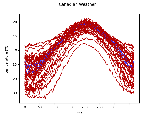
We now plot the curves with their corresponding color:
fd_temperatures.plot(
    group=labels,
    group_colors=colormap([color, outliercol, 0.9]),
)
<Figure size 640x480 with 1 Axes>
Total running time of the script: (0 minutes 0.704 seconds)