Note
Go to the end to download the full example code. or to run this example in your browser via Binder
Meteorological data: data visualization, clustering, and functional PCA#
Shows the use of data visualization tools, clustering and functional principal component analysis (FPCA).
# License: MIT

# sphinx_gallery_thumbnail_number = 4

from __future__ import annotations

from typing import Any, Mapping, Tuple

import cartopy.crs as ccrs
import matplotlib.pyplot as plt
import numpy as np
import sklearn.cluster
from cartopy.io.img_tiles import GoogleTiles
from matplotlib.axes import Axes
from matplotlib.figure import Figure

from skfda.datasets import fetch_aemet
from skfda.exploratory.depth import ModifiedBandDepth
from skfda.exploratory.visualization import Boxplot, MagnitudeShapePlot
from skfda.exploratory.visualization.fpca import FPCAPlot
from skfda.misc.metrics import l2_distance
from skfda.ml.clustering import KMeans
from skfda.preprocessing.dim_reduction import FPCA
In this example we explore the curves of daily temperatures at different weather stations from Spain, included in the AEMET dataset[1].
We first show how the visualization tools of scikit-fda can be used to detect and interpret magnitude and shape outliers. We also explain how to employ a clustering method on these temperature curves using scikit-fda. Then, the location of each weather station is plotted into a map of Spain with a different color according to its cluster. This reveals a remarkable resemblance to a Spanish climate map. A posterior analysis using functional principal component analysis (FPCA) explains how the two first principal components are related with relevant meteorological concepts, and can be used to reconstruct and interpret the original clustering.
This is one of the examples presented in the ICTAI conference[2].
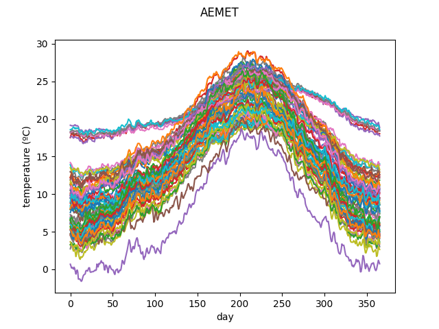
We first load the AEMET dataset and plot it.
X, _ = fetch_aemet(return_X_y=True)
X = X.coordinates[0]

X.plot()
plt.show()
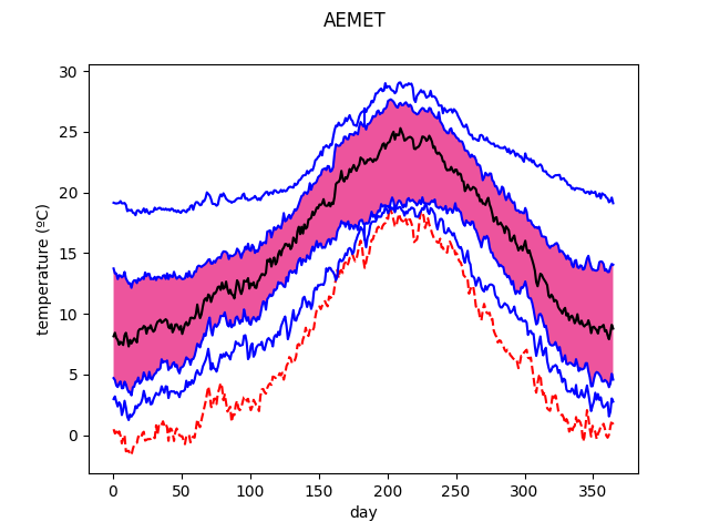
A boxplot can show magnitude outliers, in this case Navacerrada. Here the temperatures are lower than in the other curves, as this weather station is at a high altitude, near a ski resort.
Boxplot(
    X,
    depth_method=ModifiedBandDepth(),
).plot()
plt.show()
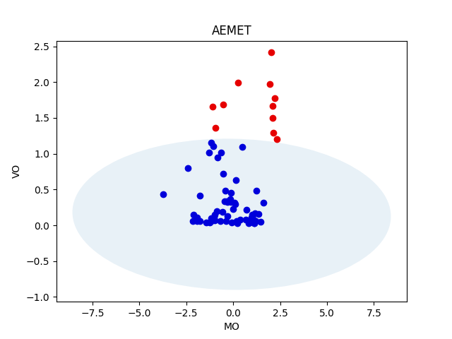
A magnitude-shape plot can be used to detect shape outliers, such as the Canary islands, with a less steeper temperature curve. The Canary islands are at a lower latitude, closer to the equator. Thus, they have a subtropical climate which presents less temperature variation during the year.
MagnitudeShapePlot(
    X,
).plot()
plt.show()
We now attempt to cluster the curves using functional k-means.
n_clusters = 5
n_init = 10

fda_kmeans = KMeans(
    n_clusters=n_clusters,
    n_init=n_init,
    metric=l2_distance,
    random_state=0,
)
fda_clusters = fda_kmeans.fit_predict(X)
We want to plot the cluster of each station in the map of Spain. We need to define first auxiliary variables and functions for plotting.
coords_spain = (-10, 5, 34.98, 44.8)
coords_canary = (-18.5, -13, 27.5, 29.5)

# It is easier to obtain the longitudes and latitudes from the data in
# a Pandas dataframe.
aemet, _ = fetch_aemet(return_X_y=True, as_frame=True)

station_longitudes = aemet.loc[:, "longitude"].values
station_latitudes = aemet.loc[:, "latitude"].values


def create_map(
    coords: Tuple[float, float, float, float],
    figsize: Tuple[float, float],
) -> Figure:
    """Create a map for a region of the world."""
    tiler = GoogleTiles(style="satellite")
    mercator = tiler.crs

    fig = plt.figure(figsize=figsize)
    ax = fig.add_axes([0, 0, 1, 1], projection=mercator)
    ax.set_extent(coords, crs=ccrs.PlateCarree())

    ax.add_image(tiler, 8)
    ax.set_adjustable('datalim')

    return fig


def plot_cluster_points(
    longitudes: np.typing.NDArray[np.floating[Any]],
    latitudes: np.typing.NDArray[np.floating[Any]],
    clusters: np.typing.NDArray[np.integer[Any]],
    color_map: Mapping[int, str],
    ax: Axes,
) -> None:
    """Plot the stations in a map with their cluster color."""
    for cluster in range(n_clusters):
        selection = (clusters == cluster)
        ax.scatter(
            longitudes[selection],
            latitudes[selection],
            s=64,
            color=color_map[cluster],
            edgecolors='white',
            transform=ccrs.Geodetic(),
        )


# Colors for each cluster
fda_color_map = {
    0: "purple",
    1: "yellow",
    2: "green",
    3: "red",
    4: "orange",
}

# Names of each climate (for this particular seed)
climate_names = {
    0: "Cold/mountain",
    1: "Mediterranean",
    2: "Atlantic",
    3: "Subtropical",
    4: "Continental",
}
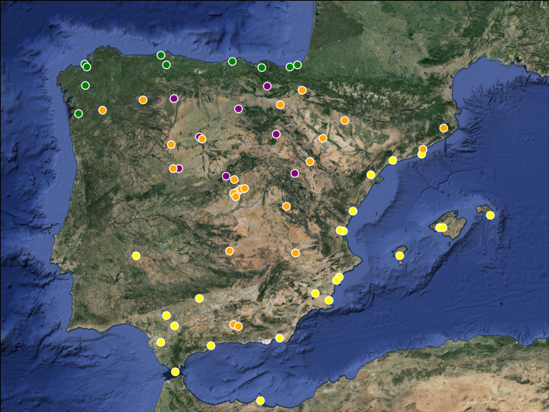
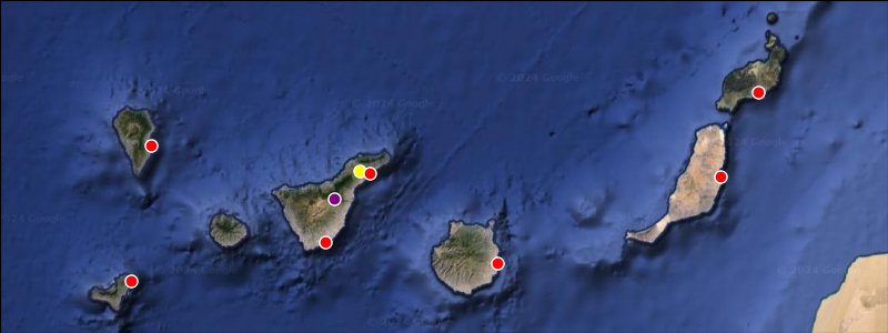
We now plot the obtained clustering in the maps.
It is possible to notice that each cluster seems to roughly correspond with a particular climate:
Red points, only present in the Canary islands, correspond to a subtropical climate.
Yellow points, in the Mediterranean coast, correspond to a Mediterranean climate.
Green points, in the Atlantic coast of mainland Spain, correspond to an Atlantic or oceanic climate.
Orange points, in the center of mainland Spain, correspond to a continental climate.
Finally the purple points are located at the coldest regions of Spain, such as in high mountain ranges. Thus, it can be associated with a cold or mountain climate.
Notice that a couple of points in the Canary islands are not red. The purple one is easy to explain, as it is in mount Teide, the highest mountain of Spain. The yellow one is in the airport of Los Rodeos, which has its own microclimate[3].
# Mainland
fig_spain = create_map(coords_spain, figsize=(8, 6))
plot_cluster_points(
    longitudes=station_longitudes,
    latitudes=station_latitudes,
    clusters=fda_clusters,
    color_map=fda_color_map,
    ax=fig_spain.axes[0],
)

# Canary Islands
fig_canary = create_map(coords_canary, figsize=(8, 3))
plot_cluster_points(
    longitudes=station_longitudes,
    latitudes=station_latitudes,
    clusters=fda_clusters,
    color_map=fda_color_map,
    ax=fig_canary.axes[0],
)
plt.show()
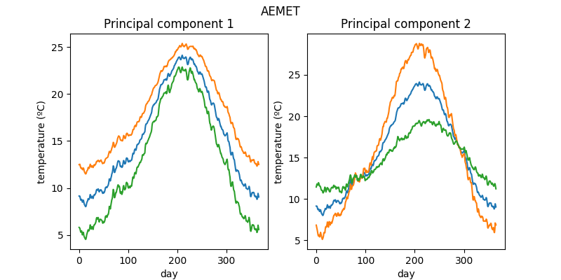
We now can compute the first two principal components for interpretability, and project the data over these directions.
We now plot the first two principal components as perturbations over the mean.
The factor parameters is a number that multiplies each component in
order to make their effect more noticeable.
It is possible to observe that the first component measures a global increase/decrease in temperature. The second component instead has the effect of increasing/decreasing the variability of the temperatures during the year.
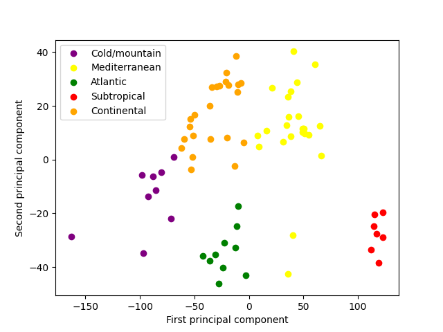
We also plot the projections over the first two principal components, keeping the cluster colors. Here we can easily observe the corresponding characteristics of each climate in terms of global temperature and annual variability. The two outliers of the Mediterranean climate correspond to the aforementioned airport of Los Rodeos, and to Tarifa, which is located at the strait of Gibraltar and thus receives also the cold waters of the Atlantic, explaining its lower annual variability.
fig, ax = plt.subplots(1, 1)
for cluster in range(n_clusters):
    selection = fda_clusters == cluster
    ax.scatter(
        X_red[selection, 0],
        X_red[selection, 1],
        color=fda_color_map[cluster],
        label=climate_names[cluster],
    )

ax.set_xlabel('First principal component')
ax.set_ylabel('Second principal component')
ax.legend()
plt.show()
We now attempt a multivariate clustering using only these projections.
mv_kmeans = sklearn.cluster.KMeans(
    n_clusters=n_clusters,
    n_init=n_init,
    random_state=0,
)
mv_clusters = mv_kmeans.fit_predict(X_red)
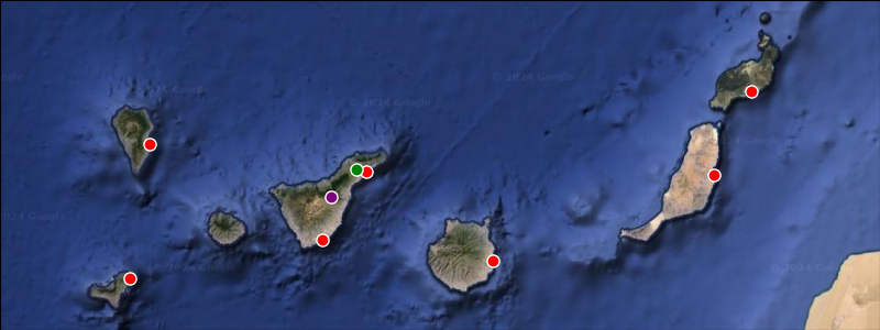
We now plot the multivariate clustering in the maps. We define a different color map to match cluster colors with the previously obtained ones. As you can see, the clustering using only the two first principal components matches almost perfectly with the original one, that used the complete temperature curves.
mv_color_map = {
    0: "yellow",
    1: "orange",
    2: "red",
    3: "purple",
    4: "green",
}

# Mainland
fig_spain = create_map(coords_spain, figsize=(8, 6))
plot_cluster_points(
    longitudes=station_longitudes,
    latitudes=station_latitudes,
    clusters=mv_clusters,
    color_map=mv_color_map,
    ax=fig_spain.axes[0],
)

# Canary Islands
fig_canary = create_map(coords_canary, figsize=(8, 3))
plot_cluster_points(
    longitudes=station_longitudes,
    latitudes=station_latitudes,
    clusters=mv_clusters,
    color_map=mv_color_map,
    ax=fig_canary.axes[0],
)
plt.show()

References#
Total running time of the script: (0 minutes 3.339 seconds)