Note
Go to the end to download the full example code. or to run this example in your browser via Binder
Mixed effects model for irregular data#
This example converts irregular data to a basis representation using a mixed effects model.
# Author: Pablo Cuesta Sierra
# License: MIT

# sphinx_gallery_thumbnail_number = -1

import matplotlib.pyplot as plt
import numpy as np
import pandas as pd
from sklearn.model_selection import train_test_split

from skfda import FDataBasis, FDataIrregular
from skfda.datasets import fetch_weather, irregular_sample
from skfda.misc.scoring import mean_squared_error, r2_score
from skfda.representation.basis import BSplineBasis, FourierBasis
from skfda.representation.conversion import EMMixedEffectsConverter
Sythetic data#
For this example, we are going to simulate the irregular sampling of a dataset following the mixed effects model, to later attempt to reconstruct said original dataset.
We generate the original basis representation of the data following the mixed effects model for irregular data as presented by James[1]. This just means that the coefficients of the basis representation are generated from a Gaussian distribution.
n_curves = 70
n_basis = 4
domain_range = (0, 10)
basis = BSplineBasis(n_basis=n_basis, domain_range=domain_range, order=3)

coeff_mean = np.array([-15, 20, -4, 6])
coeff_cov_sqrt = np.array([
    [4.0, 0.0, 0.0, 0.0],
    [-3.2, -2.6, 0.0, 0.0],
    [4.7, 2.9, 2.0, 0.0],
    [-1.9, 6.3, 4.6, -3.6],
])
random_state = np.random.RandomState(seed=34285676)
coefficients = (
    coeff_mean + random_state.normal(size=(n_curves, n_basis)) @ coeff_cov_sqrt
)
fdatabasis_original = FDataBasis(basis, coefficients)
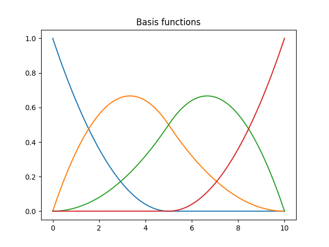
Plot the basis functions used to generate the data
basis.plot()
plt.title("Basis functions")
plt.show()
Plot some of the generated curves

We subsample the original data by measuring a random number of points per curve generating an irregular dataset. Moreover, we add some Gaussian noise to the data.
fd_irregular_without_noise = irregular_sample(
    fdata=fdatabasis_original,
    n_points_per_curve=random_state.randint(2, 6, n_curves),
    random_state=random_state,
)
noise_std = .3
fd_irregular = FDataIrregular(
    points=fd_irregular_without_noise.points,
    start_indices=fd_irregular_without_noise.start_indices,
    values=fd_irregular_without_noise.values + random_state.normal(
        0, noise_std, fd_irregular_without_noise.values.shape,
    ),
)
Plot 3 curves of the newly created irregular data along with the original

We split our irregular data into two groups, the train curves and the test curves.
train_original, test_original, train_irregular, test_irregular = (
    train_test_split(
        fdatabasis_original,
        fd_irregular,
        test_size=0.3,
        random_state=random_state,
    )
)
Now, we create and train the mixed effects converter using the train curves, and we convert the irregular data to basis representation. For comparison, we also convert to basis representation using the default basis representation for each curve, which is done curve-wise instead of taking into account the whole dataset.
converter = EMMixedEffectsConverter(basis)
converter.fit(train_irregular)

train_converted = converter.transform(train_irregular)
test_converted = converter.transform(test_irregular)

train_functionwise_to_basis = train_irregular.to_basis(
    basis,
    conversion_type="function-wise",
)
test_functionwise_to_basis = test_irregular.to_basis(
    basis,
    conversion_type="function-wise",
)
To visualize the conversion results, we plot the first original and converted curves of the test set.
fig = plt.figure(figsize=(11, 16))
plt.suptitle("Comparison of the original and converted data (test set)")
for k in range(10):
    axes = plt.subplot(5, 2, k + 1)

    test_irregular[k].scatter(axes=axes, color=f"C{k}", label="Irregular")
    test_original[k].plot(
        axes=axes, color=f"C{k}", alpha=0.5, label="Original",
    )
    test_functionwise_to_basis[k].plot(
        axes=axes, color=f"C{k}", linestyle=":", label="Function-wise",
    )
    test_converted[k].plot(
        axes=axes, color=f"C{k}", linestyle="--", label="Mixed-effects",
    )
    axes.legend()
    plt.ylim((-27, 27))  # Same scale for all plots

plt.tight_layout(rect=[0, 0, 1, 0.98])
plt.show()

As can be seen in the previous plot, when measurements are distributed across the domain, both the mixed effects model and the function-wise conversion are able to provide a good approximation of the original data. However, when the measurements are concentrated in a small region of the domain, e can see that the mixed effects model is able to provide a more accurate approximation. Moreover, the mixed effects model is able to remove the noise from the measurements, which is not the case for the function-wise conversion.
Finally, we make use of the \(R^2\) score and the \(MSE\) to compare the converted basis representations with the original data, both for the train and test sets.
score_functions = {"R^2": r2_score, "MSE": mean_squared_error}
scores = {
    score_name: pd.DataFrame({
        "Mixed-effects": {
            "Train": score_fun(train_original, train_converted),
            "Test": score_fun(test_original, test_converted),
        },
        "Curve-wise": {
            "Train": score_fun(train_original, train_functionwise_to_basis),
            "Test": score_fun(test_original, test_functionwise_to_basis),
        },
    })
    for score_name, score_fun in score_functions.items()
}
for score_name, score_df in scores.items():
    print(f"{score_name} scores:")
    print("-" * 35)
    print(score_df, end="\n\n\n")
R^2 scores:
-----------------------------------
       Mixed-effects  Curve-wise
Train       0.938600  -60.547529
Test        0.900498  -67.636766


MSE scores:
-----------------------------------
       Mixed-effects   Curve-wise
Train       0.993315  1591.071517
Test        1.932750   253.514808
Real-world data#
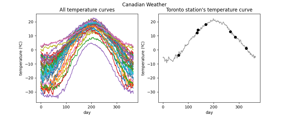
The Canadian Weather dataset is downloaded from the package ‘fda’ in CRAN. It contains a FDataGrid with daily temperatures and precipitations, that is, it has a 2-dimensional image. We are interested only in the daily average temperatures, so we will use the first coordinate.
As we want to illustrate the conversion of irregular data to basis, representation, we will take an irregular sample of the temperatures dataset containing only 7 points per curve.
weather = fetch_weather()
fd_temperatures = weather.data.coordinates[0]

random_state = np.random.RandomState(seed=73947291)
irregular_temperatures = irregular_sample(
    fdata=fd_temperatures, n_points_per_curve=7, random_state=random_state,
)
The dataset contains information about the region of each station, which have different types of climate. We save the indices of the stations in each region to later plot some of them.
print(weather.categories["region"])
arctic = np.where(weather.target == 0)[0]
atlantic = np.where(weather.target == 1)[0]
continental = np.where(weather.target == 2)[0]
pacific = np.where(weather.target == 3)[0]
['Arctic' 'Atlantic' 'Continental' 'Pacific']
Here we plot the original data alongside one of the original curves and its irregularly sampled version.
fig = plt.figure(figsize=(10, 4))

axes = plt.subplot(1, 2, 1)
fd_temperatures.plot(axes=axes)
ylim = axes.get_ylim()
plt.title("All temperature curves")

axes = plt.subplot(1, 2, 2)
k = 13  # index of the station
fd_temperatures[k].plot(axes=axes, color="black", alpha=0.4)
irregular_temperatures[k].scatter(axes=axes, color="black", marker="o")
plt.ylim(ylim)
plt.title(f"{fd_temperatures.sample_names[k]} station's temperature curve")

plt.show()
Now, we convert the irregularly sampled temperature curves to basis representation. Due to the periodicity of the data, a Fourier basis is used.
basis = FourierBasis(n_basis=5, domain_range=fd_temperatures.domain_range)
irregular_temperatures_converted = irregular_temperatures.to_basis(
    basis, conversion_type="mixed-effects",
)
curvewise_temperatures_converted = irregular_temperatures.to_basis(
    basis, conversion_type="function-wise",
)
To visualize the conversion, we now plot 4 of the converted curves (one from each region) along with the original temperatures and the irregular points that we sampled.
idxes = [arctic[0], atlantic[11], continental[3], pacific[3]]
fig = plt.figure(figsize=(10, 10))
for k in range(4):
    axes = plt.subplot(2, 2, k + 1)
    plt.tight_layout()
    idx = idxes[k]
    fd_temperatures[idx].plot(
        axes=axes, color=f"C{k}", alpha=0.5, label="Original",
    )
    curvewise_temperatures_converted[idx].plot(
        axes=axes, color=f"C{k}", linestyle=":", label="Function-wise",
    )
    irregular_temperatures_converted[idx].plot(
        axes=axes, color=f"C{k}", linestyle="--", label="Mixed-effects",
    )
    irregular_temperatures[idx].scatter(
        axes=axes, color=f"C{k}", alpha=0.5, label="Irregular",
    )
    plt.title(
        f"{fd_temperatures.sample_names[idx]} station "
        f"({weather.categories['region'][weather.target[idx]]})"
    )
    plt.ylim(ylim)
    axes.legend()

plt.show()
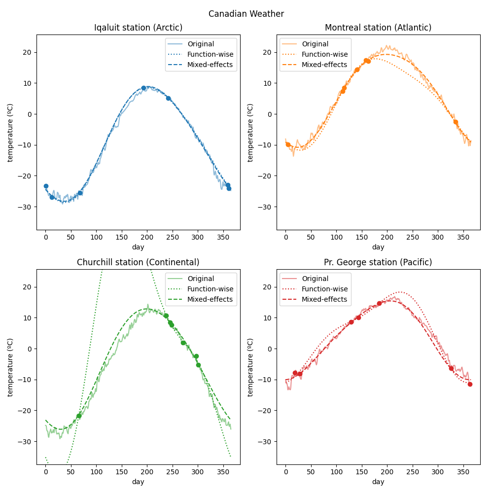
Finally, we get a score of the quality of the conversion by comparing the obtained basis representation with the original data from the CRAN dataset. The \(R^2\) score is used.
Note that, to compare the original data and the basis representation (which
have different FData types), we have to evaluate the latter at
the grid points of the former.
r2_me = r2_score(
    fd_temperatures,
    irregular_temperatures_converted.to_grid(fd_temperatures.grid_points),
)
r2_curvewise = r2_score(
    fd_temperatures,
    curvewise_temperatures_converted.to_grid(fd_temperatures.grid_points),
)
print(f"R2 score (function-wise): {r2_curvewise:f}")
print(f"R2 score (mixed-effects): {r2_me:f}")
R2 score (function-wise): -0.445817
R2 score (mixed-effects): 0.935085
As in the synthetic case, both conversion types are similar for the curves where the measurements are distributed across the domain. Otherwise, the mixed-effects model provides a more accurate approximation in the regions where the measurements of one curve are missing by using the information from the whole dataset.
References#
Total running time of the script: (0 minutes 6.659 seconds)